Outcome 2 week 2 page 1-2 Elements and principles of design. I chose to broaden my knowledge and horizons and learn to understand the elements and principles of design and how they are used in all forms of art to enable me to theoretically reference my work and also understand the work of other artists and photographers. The elements and principles of design is a psychological theory, which can be used to stimulate the mind and affect the way it responds to the image A brief definition of what are the key elements and principle.
http://www.educ.kent.edu/community/VLO/Design/elements/line/index.htmlLines are used to direct the viewers’ eyes in and out of the image and also lead to a specific point of interest. Repetition creates an interesting sequence of shapes or patterns to engage the viewer. The direction of the light is positioned to create differing tonal shades of colours. This is normally placed on an angle which allows the object or subject to cast different tonal ranges. This adds emphasis to objects and creates the atmosphere and mood of the piece. Texture is indicated, the rough or smoothness of surface can be emphasised by light depending on the angle or direction. It gives a feel and indicates how hard or soft an object or subject is and it adds to the mood of the image. Balance is also important, there are two types of balance , symmetrical and asymmetrical , both can be effective depending on how they are used. Symmetrical balance is having two equal halves and asymmetrical balance is when one half is heavier and more dominant
Outcome 2 week 2 page 3-4 Symbolic Gardens, including still lifes. The book explains the symbols used in different types of gardens within paintings /art. I chose to conduct this research to have an understanding of subject matters in a traditional still life painting to depict some of the elements and use in a contemporary form which current photographers are doing.
Outcome 2 week 2 page 5-6 Colour. Colour is one of the imperative aspects of the elements of design. I decided to conduct this research and expand my knowledge on colours to know how they are formed, how they complement each other and how they are used when composing a frame. This research has given me an adequate understanding of the types of colours and how to blend them together to create a feel. Book research.
Outcome 2 week 2 page 7 BBC Home design–planning a colour scheme. After conducting in depth research on the colour wheel I decided to research how colour is used the colours referenced from the previous research. I found they used split colour to give variation of tones to create a mood.
Outcome 2 week 2 page 9 The classic elements of Visual Design enhancing your photographs. The classic elements of visual design are broken down in 7 types, shapes, forms, lines, colour, texture, space and patterns. The positive effect on negative space in photography. The use of negative and positive space is important in the principles and elements of design. The positive space is normally the subject within the image and the negative is the space around the subject. The use of negative space helps to great an emphasis on the positive space. The negative space also allows the viewer’s eye to refresh if there is a lot of complex detail in the subject. It also enhances the richness of the subject.
As part of my research of understand how modern day photography depicts from traditional still life paintings, i have watch the complete scries of John Berger’s ways of seeing. https://www.youtube.com/watch?v=0pDE4VX_9Kk
Is there a relationship between traditional still life paintings and modern day photographic images used within the food advertising industry?
My aim is to investigate whether modern day photographic images used within the food advertising industry have a link to still life paintings of the past.. It will identify how the elements and principles of design are depicted in medieval, still life paintings and then investigate the link between medieval still life paintings and still life photography before considering how these elements are used in modern advertising images.
The elements and principles of design is a psychological theory, which can be used to stimulate the mind and affect the way it responds to the image[i]. Lines are used to direct the viewers’ eyes in and out of the image and to lead to a specific point of interest. Repetition creates an interesting sequence of shapes or patterns to engage the viewer. The direction of the light is positioned to create differing tonal shades of colours. This is normally placed on an angle which allows the object or subject to cast different tonal ranges. This adds emphasis to objects and creates the atmosphere and mood of the piece. Texture is indicated, the rough or smoothness of surface can be emphasised by light depending on the angle or direction. It gives a feel to the content and indicates how hard or soft an object or subject is, further adding to the atmosphere and mood.
The use of negative and positive space is important in the principles and elements of design. The positive space is normally the subject within the image and the negative space is around the subject. The use of negative space helps to create an emphasis on the positive space. The negative space also allows the viewer’s eye to refresh if there is a lot of complex detail in the subject and it also enhances the richness of the subject. Balance is also important. There are two types of balance, symmetrical and asymmetrical, both can be effective depending on how they are used. Symmetrical balance is having two equal halves and asymmetrical balance is when one half is heavier and more dominant than the other.
Chapter I will identify the principles and elements of design used in still life paintings by Floris Gerritsz. van Schooten and Jan Van Kessel, pioneers in the still life genre, to show how they visually communicated with their audience. Chapter 2 will consider early photography focusing on the Pictorialist photographer Alfred Stieglitz and compare Roger Fenton’s photograph ‘Still life with Fruit and Decanter’ (1860) with George Foster’s still life painting, ‘Still life with Fruit and Wineglass’ (1872). Chapter 3 will compare Raphaelle Peale’s paintings ‘Fruit in a Silver Basket’ (1814) and ‘Cutlet and Vegetables’ (1816) with the modern photographer Sharon Core photographs, ‘Apple in a Porcelain Basket’ (2007) and ‘Steak and Asparagus (2008) Chapter 4 will analyse the elements and principle of design in images used in modern day food advertising.
Chapter 1 Medieval Still life painting and the principles and elements of design
The primary foundation of still life painting is that they were very significant and distinct to their prime location. They were one off individual original works. A key aspect of fine art painting is that the majority were restricted to very rich individuals or religious organisations. The general public did not have access to many still life paintings and a great deal of their significance was in their uniqueness.
Berger[ii] explains the uniqueness of being in a single place. The general public went to see it which meant it was more valued and the place where it was exhibited added to its meaning, for example they were often in church.
“ originally painting were an integral part of the building for which they design. A good example would be Renaissance churches or chapels, you have a feeling that the images on the walls are records of the building’s interior life and makes up the buildings memory…its uniqueness is part of the uniqueness of the single place where it is and can be seen. Everything around it around it confirms and consolidates its meaning”[iii]
The only people who could afford to commission paintings were the upper and middle class, the rich and wealthy. These paintings were commissioned to show their lifestyle and way of living. They hung still life paintings of food, fruits and vegetables in their dining rooms to show the type of food they were able to eat. This concept applied to other areas as well. They had fashionable portraits in living areas and portraits in libraries which signified their knowledge, power and status[iv].
Kitchen Still-Life – Schooten Floris Gerritsz. van Schooten 1590 – 1655
In this painting the woman appears to be a housemaid preparing a banquet for her master’s household. The table has a rich array of produce which looks fresh. The painter has used the light to create tones and shades which emphasizes on detail to reveal the produces freshness. He has finely painted the content emphasizing the detail to show both quantity and quality. The painting references the elements of design. As a whole it has an asymmetrical[v] balance. The left side is more dominant, heavily weighted with more volume. The black rectangle shape above, and the basket in the bottom left, drags the eye to this side of the painting and puts an emphasis on the plate of bread sitting on the bucket. The contrast on the right of the image catches the eye and the leading diagonal lines of the table direct the eye towards the heavy left side of the painting. There is a lot of contrast at the centre but the heaviness and contrast on the left particularly absorbs the eye.
The light is used for emphasis. The light rays appear to be coming diagonally through the top left hand corner creating shadows on the objects. This is achieved by the mixture of tones and the tonal range of hue and saturated colours. The texture of the negative, white space and of the positive space is created by brush strokes moving horizontally. Whilst the negative space lines flow to the left of the painting, the positive lines appear to flow to the right. This has the effect of leading the eye across the painting. The contrast of the negative space also leads the eye to the left until it meets the dark rectangle shape which bounces it back to the right in radial lines. The radial lines form the heavily weighted left side of the table drawing the eye back to the lighter contrast in the right side of the painting, towards the brighter side, focusing on the woman. This painting is typical of medieval still life painting commissioned by the wealthy to hang in their homes.
Jan Van Kessel
‘Still-Life on a Table with Fruit and Flowers’ Circa1640-1679
Jan Van Kessel is also a still life painter in the pictorialist style. The painting ‘Still-Life on a Table with Fruit and Flowers’does not look like a banquet or meal, it looks like a selection of fruits, nuts, bread and wine. Having this variety of food available on a side table signifies wealth in medieval times. The squirrel on the table also symbolises the excess amount of food that was available. In terms of the elements and principles of design, the spacing and positioning of the items in the painting are carefully considered. The painting is horizontally divided into two halves having the background as the negative space and the foreground as the positive. The positive space, the foreground, is well balanced with circular shapes and forms spreading across the table. This gives a semi repetitive feel which allows the eye to move around the table following the movement created by the shapes and forms. The positioning of the light has created parallel and radial lines. The parallel lines which move the eye across the painting from left to right and the redial lines direct the eye towards the centre, this leads the eye to a distinct and significant part of the painting which shows the squirrel on the table. The table has been laid out ready for the occupants, the squirrel and hamsters on the table are not being disturbed, they are eating the nuts and seeds. This is a statement which symbolizes wealth and plenty.
There is depicted a major source of light pacing through the top left angle of the painting creating tones, colour and shadows. There are distinct light rays hitting the jug in the far top right corner allowing it to be one of the dominant forms of the painting. There is an illusion of a zig zag line running across the table linking the white plates and onto the jug. The table’s contents are spread out but there is a flow in movement, moving eye in a zig zaglooking at the small forms first, then onto the bigger ones and back to the smaller ones. This rotates the eye constantly around the table.
Although the painting is highly detailed the softness of the light limits the amount of texture that is seen. Early Pictorialist photographers used similar lighting techniques.
Chapter 2 Early still life photography
Photography has always been influenced by paintings since its birth when critics argued that it was a form of documentation and not art. In the late eighteen hundreds, when photography was in its infancy, Alfred Stieglitz was one of the pioneers who recognized photography as a form of art and not just a means of documentation. He tried to relate his prints to oil painting when processing or developing a negative. He used techniques that were used in paintings to give the image a feel of an oil painting [vi].
Early photographers were less concerned with the composition of the photograph, they concentrated on making it look like a painting. The techniques they used to alter the images were scratching the negative by hand and using brushes to soften and blur part of the photograph during the print processing and using a soft focus to mimic the fine soft brushes[vii].
Stieglitz’s photograph ‘Vanetian Canal’1894
Thephotograph ‘Vanetian Canal’ (1894) by Stieglitz shows an alleyway of a seemingly industrial city. The feel the image portrays is neglect and isolation and it is composed like a fine art painting. From a distance the image looks like an abstract painting. Stieglitz puts more emphasis on the bottom part of the image, which is the reflection of the building and boats on the water. This gives a greater softness to the subject making it look more like a painting. This image is a great example of Stieglitz’s argument that photography is an art form and not just a mechanical means of documenting. In terms of the elements and principles of design, the image is composed of a repetition of tonal, vertical lines, which create a high tonal range generating interest for the viewer. The reflection on the water continues, to show the scale of the building and the light sky above. This lightness contrasts with the positive space of the subject, the boats. The vertical lines guides the eye up and down the painting and at the horizon of the painting lies a bridge, which moves the eye across the painting to the right, and to the left.
Stieglitz’s photograph Spring Showers, The Coach 1902
In his photograph, ‘Spring Showers, The Coach,’ Stieglitz’s has used a similar style of composition to the ‘Venetian Canal’ photograph to create the frame. The image comprises of a mixture of positive and negative space with reflection of the subject onto water below. The image is divided into two halves. The left half has a dark feel, with the repetition of trees leading to the horizon. These develop a pattern with similar space in between them putting an emphasis on the right half, which is brighter and shows motion through the people and carriage. The image is asymmetrical with the right side being dominant due to its brightness and motion. Most of the lines are vertical except for the curved line that shoots through the bottom left of the image which brings the eye to the bottom front of the image.
Alfred Stieglitz’s photograph ‘The Steerage’ 1907
Stieglitz’s photograph, ‘The Steerage’ (1907) shows the division between the classes on a boat deck. The image is divided into two sections, the rich and the poor. The top section caters for the poor, it portrays a congested area with people looking down and admiring and envying the better off people below. The people below have more space to move around and they pay no attention to or envy the people above. All access linking the two sections seem to be blocked with no free movement between the two. In terms of the elements and principles of design. Stieglitz has emphasized on the use of negative and positive space. The eye is drawn to the positive light space in the top half of the image which has a bright light behind the people creating silhouette figures of great contrast. The congestion of the figures creates more pattern, texture and repetition allowing the top deck to be the dominant and makes it the centre of attention. There is a mixture of leading lines, which help the eye to navigate around the frame. The vertical line on the staircase brings the viewer’s eye down to the bottom deck where a boy lies on the railings wearing light clothing. The black negative space behind the boy and the railings places an emphasis on the leading line[viii]. The majority of the people on the lower deck have light clothing which contrasts with the black negative space behind. This puts an emphasis on what is happening in the foreground. There is a triangular form underneath the bridge with curved lines above pointing onto the bridge. This leads the eye onto the bridge following the horizon path through to the top deck. The lines on the edges of the frame are connected vertically and horizontally which navigates the eye around the frame
Roger Fenton, like Stieglitz was a photographer who created Art. He began photographing still life of fruit and flowers towards the end of his photography career. The Getty museum says that “still life were his conscious effort to align the medium of photography with more traditional art form of painting”[ix]
Roger Fenton’s photograph, ‘Still life with Fruit and Decanter’ 1860
The Getty Museum describes his compositionsStill life with Fruit and Decanter’ 1860 as;
“showing a bounty of edibles displayed against a rich texture of fringed lace and plaid shawls. The spikey stems of the pineapple push forwards in the frame begging to be plucked to expose the sweet ripeness inside. A glass decanter, its mouth and stopper subtly echoing the plump curves of the velvety peaches, glistening grapes and succulent squash, refers slyly to wine, that most intoxication fruit of fruits”.[x]
Fenton’s photograph, ‘Still life with fruit and decanter,’ 1860 has similarities to George Foster’s still life painting, ‘Still life with Fruit and Wine Glass’, 1872.
George Foster’s still life painting ‘Still life with fruit and wine glass, 1872
In terms of composition the painting and photograph are similar. The subject in both is placed in the front centre and fills a third of the frame. Fenton uses monochrome to emphasize the texture and detail, making the white highlights dominant. There is negative and positive white space in the background, both spaces emphasizing on the subjects. The light is creating a vast range of tones on the grapes and pineapple contrasting the two. The repetition of tone and texture on the grapes balances with the pineapple creating symmetry. The leading lines on the plaid absorb and draw attention onto the subject.
The elements and principles of design found in both the painting and photograph from the 19th Century can also be seen in contemporary photography.
Chapter 3 Medieval still life painting and modern photography
The still life early-American painter Raphaelle Peale (1774-1825) was considered one of the finest artists of his generation, he was a master of the still life genre. Raphaelle Peale was taught to paint by his father, Charles Willson Peale (1741-1827), an accomplished soldier, scientist, artist, and founder of a dynasty of early American painters. By the age of twenty-one, Raphaelle was recognized America’s first and leading still life painter.
[xi]
Raphaelle Peale’s ‘Fruit in A Silver Basket’ 1774-1825
In the still life painting by Raphaelle Peale (1774-1825), ‘Fruit in A Silver Basket,’ he references the elements and principles of design. The subject is placed in the centre of the foreground in the positive space where it clearly stands out. It has been carefully painted to emphasize all the detail tone and texture. The light seems to be coming from a single source which creates low and high key areas. This allows the colours, shapes and forms of the subject to be high key which makes the fruits and the fruit basket the centre of attention. The warmness of the colours make it feel ‘cosy’. The surface on which the subject is placed makes it seem homely and gives the image a sense of belonging to one’s home.
Peale has used the negative space for the background to emphasize the subject. He places a strong emphasis on fine detail which tells us that the image was carefully composed and painted. An example of this would be the melon. It has been sliced to show the detail that lies within which has been carefully painted to emphasize its texture, colour and feel. The melon captures the viewer’s eye as it has a fresher and brighter colour, it also stands out because of its size. It is bigger than the other fruits. Displaying it sliced makes it more available and it is positioned tilted towards the viewer invitingly. The image is contrasted by the apple parallel to the melon which does the opposite, it makes the painting less inviting and available to eat and makes it stand out just as a work of art. There are various types of colours,which complement each other and blend together, to make the painting feel natural. The painting is so fine and rich with detail it almost looks like a photograph.
The painting uses the principles and elements of design. As a whole its balance is asymmetrical, the right side is made more dominant by emphasizing the melon and red pepper. The right side also has a greater range of shapes making it more interesting to the viewer. The subject is positioned in the centre of the tonal, positive and negative space and placed where the dark space and light space meet. The collision of the two infuses, producing a good tonal range in the horizon which makes it more interesting, capturing the eye and drawing it in. There is an illusion of a diagonal line which connects the pepper on the right and with the apple on the top left , the pepper is positioned in the dominate side of the painting and is more saturated, the contrasting tone on the apple of the top left creates a connection with the pepper. This is achieved through the similarity of the colours. The repetition of colours, which are slightly de-saturated compared to the pepper, creates a link through repetition. There is also a repetition of circular shapes contrasting with the melon.
The photographer, Sharon Core’s color photographs from her Early American series titled “Still Life with Steak and Asparagus” (2008) and “Apples in a Porcelain Basket” (2007) found inspiration Raphaelle Peale’s (1774-1825) still life paintings
Sharon Core was inspired by Peale’s still life painting ‘Fruit in a Silver Basket,’ like Peale, she referenced the principles and elements of design.
Sharon Core’s Apples in a Porcelain Basket” 2007
In her photograph ‘Apples in a Porcelain Basket’ the setting and the lighting techniques are similar. The setting is similar in terms of composition in which the subject is placed in the centre of the foreground where it clearly stands out. The single source of light brings out the tone, texture and details emphasizing all the detail, tone and texture. There are harsh shadows and the low key effect for the background, which is dark, and high key for the foreground makes the fruits and the fruit basket the centre of attention.
The photograph’s light is much softer than the paintings. Soft tones blend with harsh shadows which reduces the intensity of detail. The fruit is less inviting to eat and the way it is presented is less inviting than the painting. The painting had balance between inviting and less inviting whilst the photograph does not invite. Core is mimicking the painting so she has used soft light to give it a fine art feel and to make it like a pictorialist painting. The table the basket is displayed on gives the image a warm, homely feel. Core focuses more on the basket than Peale, it takes up more of the composition. Both images have similar composition, techniques and lighting which makes them almost identical. The painting colours are stronger and more saturated but they also have a softness to them which gives the painting a subtle relaxing feel.
“Although flowers may be thought of as the most typical of still-life subjects, Peale was far more interested in delineating the colors and textures of food. The majority of his paintings depict fruits, and such paintings would typically have been hung as decorations in dining rooms. Cutlet and Vegetables is one of only two known paintings by Peale of meat and vegetables, and this unusually well preserved composition is the largest of Peale’s known still-life panels. An extra strip of wood was attached to the main panel, most likely to further the illusion of a real table edge. Peale and his family apparently thought well of the picture, which hung at the Peale Museum in Philadelphia, founded by the artist’s father, from the year after it was painted until the
mid-nineteenth century”[xii].
Core was also inspired by Peale’s ‘Cutlet and Vegetables’ 1816
Peale’s ‘Cutlet and Vegetables’ 1814
Peale’s painting ‘A Cutlet and Vegetable’has similarities to his ‘Fruit in a Basket’. The painting still references the elements and principles of design. The main emphasis of this painting is the meat which is complemented in the dish by the vegetables which are positioned behind it. It is also another carefully painted image which emphasizes on detail and colour. The viewer’s eye is drawn to the centre where the white highlights the detail of the meat’s composition and draws the eye to the lettuce. The composition of the painting shows the meat laid out on the table available ready to be cooked, making it inviting. The warm colours of the painting also make it look cosy and inviting.
Sharon Core was inspired by Peale’s fine art style for her photograph ‘Still Life with Steak and Asparagus’
[xiii]
Sharon Core’s Still Life with Steak and Asparagus 2008
Her photograph has depicted similar elements to Peale’s painting showing a soft and subtle tone of lighting to illuminate the subject. She emphasizes on the detail but not as strongly as Peale. The centre of attention on this image is the asparagus as it is the whitest subject in the frame. It captures the eye which then moves to the meat and circles back to the asparagus. The layout and composition makes it seem available although Core’s photograph has not got as much of warmth to it as Peale’s. Peale’s painting is more distinct in terms of welcoming the viewer into the scene. Core has used similar techniques to those used by Peale to illustrate the image. She has highlighted the subject in the foreground, darkening the background. There is little emphasis on the table which the subject is placed on. Comparing the two images the painting is more unique and creates a stronger atmosphere in terms of composition. It as a fine art image in the way it invites the viewer into a warm and welcoming atmosphere.
In terms of the elements and principles, both Core and Peale use the negative and positive space, emphasizing on white space use. The white space is the area in which the subject falls and which is not necessarily white. This area puts an emphasis on the subject allowing it to stand out.
In terms of colour, Peale used complementary colours, the orange on the meat and the green on the lettuce and salad. Having the neutral colour, the black space allows the complementary colours to be saturated. Core used similar element of design to emphasis the subject. Both Peale and Core used diagonal leading lines. In Peale the diagonal line from the right top corner leads the eye into the subject. Core uses the same element, her diagonal line is reversed starting from the left. Both use symmetry in their compositions. Peale’s painting is more symmetrically balance whilst Core’s is asymmetrical.
Core is a contemporary photographer who was mimics traditional still life. She was inspired by Peale and set out to reference his work in her own and in doing so referenced the elements of design represented in his paintings. The early pictorialist photographers argued that photographs were as creative as paintings and that it took a lot more than just pushing a button. It was not only a mechanical process of documentary it was also a way of creating art expression. To do this they used similar composition techniques to those used in painting including the elements and principles of design.
Chapter 4 Contemporary advertising
Now in the 21st century, the meaning of a painting no longer resides in its unique painting surface. Imagery used in advertising has a major influence on our daily lives. We are being bombarded with advertising images. According to Berger, we passively accept these images even if it is only for that moment[xiv] Now, the conventions of painting, combined with the elements and principles of design are being used by photographers in modern day advertising to create a mood which will have a visual impact with a romanticised feel.
Angela Moore’s image advertising Heston Blumenthal at home for Bloomsbury /GTF is an example of a contemporary photograph which uses some traditional conventions.
http://angela-moore.co.uk/food/#c-100 2014
The image borrows the style and lighting from medieval paintings to create a mystic atmosphere. Moore mirrors the use of white space and a single source of light reflecting on the subject which creates a vast tonal range reminiscent of medieval paintings. She infuses this style with minimal contemporary features, combining the three single elements. The spoon is positioned in a way that invites the viewer into the image offering the content to the viewer. In terms of the elements and principles of design the image has geometric shapes. It is balanced with leading lines into the subject, down the spoon handle and along the curve of the wooden board. The light, which reflects on the spoon attracts the viewer down into the subject.
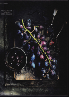
Fruit with Treacle on the board is a contemporary advert for Waitrose in the Waitrose food magazine http://2.bp.blogspot.com/-16O9xW8jq8I/T7pGKJP9DKI/AAAAAAAAAkg/RxmOXgvGvmM/s1600/Gus+Filgate,+in+Waitrose+Kitchen,+2011.png
This advertisement depicts from the elements and principles of design. The image is composed in low key lighting which is used in highlighting the edges of the subject placing emphasis on and revealing the shapes and forms. The content of this image are mostly circular forms and shapes placed on rectangle platforms. The combination of these forms highlighted creates a visual interest. The low key lighting puts an emphasis on the colour of the subject and the green line across the rectangle creates two triangles which are asymmetrically balanced. On both sides of the triangles there are metal accompaniments the left side being dominant and heavier. The right side is more colourful and saturated which gives the whole image a good balance.
The following image is from the website Food 52.com. The image is currently being used to promote people to cook home meals. The image itself has borrowed technical elements from Peale and Core in terms of lighting composition and layout.
The best British main meals http://www.foreignstudents.com/guide-to-britain/british-culture/food-and-drink/mains, 2014
Kristen Miglore is the Senior Editor, Food52.com. Her intention is to promote people to cook home meals[xv]. This image signifies how simple cooking a home meal can be. The technical elements justify the simplicity of the message. The photographer uses a soft, evening natural looking light and the subject is placed on a wooden chopping board which shows its availability. The elements in common with Peale and Core to convey the message include highlighting the subject in the foreground and darkening the background. There is more emphasis in this image on the surface which the subject is placed on to make look more homely because chopping boards like this are common in most homes. Like Peale’s paintings the light is centred on a specific area to emphasize on the texture and detail. The image also has a warm and inviting atmosphere just like Peale’s paintings which gives it a homely ambiance. The relationship with these two images is the portrayal of the message of ‘cosiness’ in one’s home.
The following is an advertisement for Bulmer Cider. This advert uses similar technical elements to Peale’s painting and Core’s photography.
http://www.talkingretail.com/products/product-news/new-campaign-for-bulmers-red-apple, 2014
In terms of the composition the subject, the bottle of cider and the apples are placed in the centre of the foreground where they clearly state the advert’s purpose. The similar element to medieval paintings is the atmosphere. The advert is light in way which creates a warm and cosy setting, which makes it look homely and welcoming. It welcomes the viewer and emphasis the detail tone and texture. The light seems to be coming from a single source, which creates harsh shadows. It uses the concept of low key effect for the background, which is dark, and high key for the fore ground, which makes the fruit and bottle stand out to be the centre of attention. Placing the apples in the barrel signifies that the cider is made from freshly picked apples. Just like Peale’s painting the photographer has used a classical setting to represent the vintage method of fermenting cider in wooden barrels.
Berger says that publicity is explained and justified as being about freedom of choice but he says that is only really true when comparing one image or two another or one product with another[xvi]. He also says the purpose of publicity is to convince us that it will make us in someway richer, even though we will be poorer by having spent our money[xvii]. Moore’s Heston Blumenthal image is a good example in that the image makes the viewer want to experience the product. Berger explains that advertising offers the spectator, buyer not reality but the anticipation of themselves enjoying the pleasure of the product[xviii]
Still life Advertising has become a genre used in modern day society, not only to persuade us to buy but to promise us a better way of living, a healthier life style and luxury, having luxury food makes the viewer feel successful. Food images are being used to sell and create a lifestyle. Photographic imagery in the 21st century has a huge impact in our daily lives. Nowadays any surface could be used as a tool with text and images to tell us how much better our lives can be. When encountered with these messages, we pause for a moment and visualise ourselves in another life. According to Berger[xix], we passively accept these images even if it is only for that moment.
Painters were commissioned by the rich and wealthy in the middle age era to represent the successful and luxurious lifestyle they were living. Contemporary advertisements are using the same elements and offering these to the viewer to provide a glimpse of success and a luxurious life style.Good publicity leaves us in a position where we have no choice but be lured to attain the promise for brighter life[xx].
Conclusion
This research concludes that there is a relationship between traditional still life paintings and modern day photographic images used within the food advertising industry. Advertising uses the language of oil paintings to convey its message. Still Life photographs that reflect back to the history of still life paintings are still originals and still hold their value of being an original piece. Photography uses the same concept as painting but commercializes the image to a wider audience so that the image comes to the people rather than the people to the image. It is like a reverse psychology compared to still life painting where the viewer has to seek out the image. It might be considered to make the image less valuable but on the other hand its aim is to commercialize the image and make it accessible.
Medieval still life paintings of food were often commissioned by the wealthy to hang in their homes and to show the lifestyle they had achieved. John Berger’s way of seeing proposes that modern day still life photography has used a similar concept, reversing the ideology of the wealthy to show people today the life style they can aspire to. The elements and principles of design that were used in paintings are now being used in advertising images to create an atmosphere of a successful and luxurious lifestyle.
[i] A brief definition of what are the key elements and principle.
http://www.educ.kent.edu/community/VLO/Design/elements/line/index.html
[ii] Berger, John (1972) Ways of Seeing : Penguin Ltd
[iii]Berger, John (1972) Ways of Seeing : Penguin Ltd
[iv] Gsek Creative diary ( 2013) Pictorialism Secessionism http://gsekulovskiphotography.wordpress.com/2013/03/04/106/
[v] Pipes,Alan (2003) Foundation art and Design ;London Laurence King Publisher Ltd
[vi]Victoria and Albert Museum, (2013) Alfred-Stieglitz . http://www.vam.ac.uk/content/articles/a/alfred-stieglitz-exhibition
[vii]Victoria and Albert Museum, (2013) Alfred-Stieglitz . http://www.vam.ac.uk/content/articles/a/alfred-stieglitz-exhibition
[viii] Faimno, Peg. And Weigand (2004) The nature of Design: Ohio, How Design Books
[ix] The J. Paul Getty Museum, (2014) Still Life with Fruit and Decanter http://www.getty.edu/art/gettyguide/artobjectdetails?artobj=60694
[x] The J. Paul Getty Museum, (2014) Still Life with Fruit and Decanter http://www.getty.edu/art/gettyguide/artobjectdetails?artobj=60694
[xi]Peale. Raphaelle (1774-1825), Fruit in A Silver Basket, 1814, o/panel, 31.8 x 49.5 cm, Manoogian collection
[xii]Timken Museum (2013) Raphaell Peale http://www.timkenmuseum.org/collection/american/cutlet-and-vegetables
[xiii]http://finitefoto.com/Core-core-at-james-kelly-contemporary
Early American, Still Life with Steak and Asparagus
[xiv] Berger, John (1972) Ways of Seeing : Penguin Ltd
[xv]The best british main meals. http://www.foreignstudents.com/guide-to-britain/british-culture/food-and-drink/mains
[xvi] Berger, John (1972) Ways of Seeing : Penguin Ltd
[xvii] Berger, John (1972) Ways of Seeing : Penguin Ltd
[xviii]Berger, John (1972) Ways of Seeing : Penguin Ltd, p134).
[xix] Berger, John (1972) Ways of Seeing : Penguin Ltd
